Green, the colour of nature, new life and sustainability can never be green ! It is ironically toxic to all forms of life and environment!
“Nature in her green, tranquil woods heals and soothes all afflictions” –John Muir
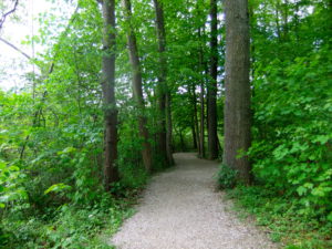
Trail walk to Laudachsee, Upper Austria
Green is the color of nature, which symbolizes renewal and growth. It also means balance, calm and harmony. It is no surprise that we feel so invigorated when we are out in the open surrounded by the beauty of nature. Such is the power of green, which manages to resonate with our inner energy, rebalancing us.
Today Green is no longer just a color. It is the symbol of Ecology!
But in an artist’s world, green has always been a troublesome color. Because mixing greens can be one of the major issues that can start to throw your landscape painting off-course. Green can be an Achilles heel for any artist, and the urge to grab premix green watercolor paint out of a tube can be hard to resist. Why is it so, I am not sure? Perhaps it has something to do with how we all actually perceive green.
As Pablo Picasso  once said: “They will sell you thousands of greens. Veronese green and emerald green and cadmium green and any sort of green you like, but that particular green, never.”
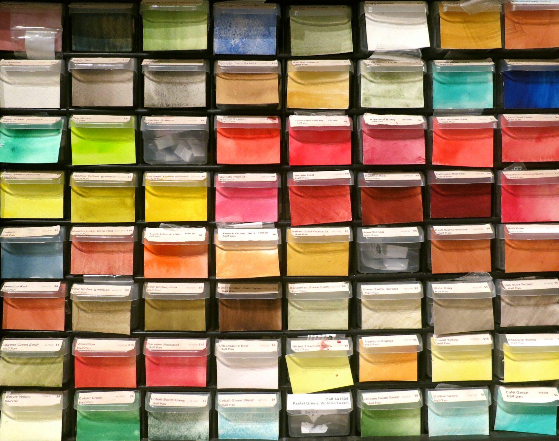
Which Colors Make Green?
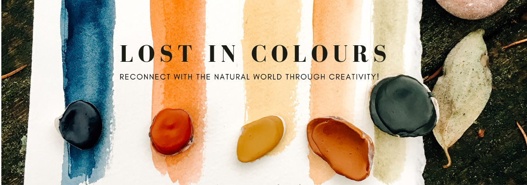
I don’t think there is one shade of green available in watercolor that depicts 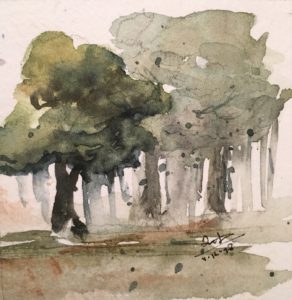 the beauty of nature in any season. That’s why I have always mixed my greens and that too using natural pigments because I strongly believe and enjoy painting in organic sensibility!
One of the basic rules of elementary school art class is that blue mixed with yellow produces green. True, those two colors alone can produce many wonderful greens, assuming that the yellow and blue paints you are using are pure yellow and pure blue. If they have been altered from their pure forms, it will consequently alter your green as well.
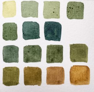
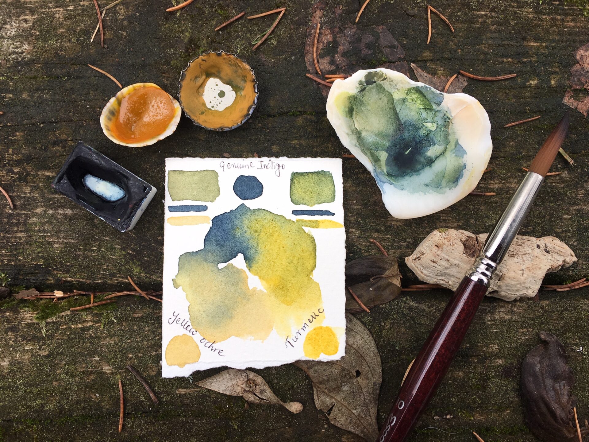
Mixing greens with genuine Indigo blue (NB1), Curcuma (NY3), Ercolano Red (PR102) and Gold Ochre (PY43). Lost in colours handmade watercolours.
The chart on left shows the most delightful greens that I have achieved with my mixing. Notice all those green (rows 1-3) were made using only two of my own handmade natural paints Indigo genuine (NB1) and Curcuma (NY3). In the last two rows, I varied the colors by adding a bit of Ercolano Red (PR102) and yellow gold ochre ( PY43). I sometimes also use Ultramarine blue (PB29) in my work to create several mixes of green with PY43. In fact, NY3 when mixed with PB29 also gives beautiful greens. Try doing several charts on your own to make some luscious greens!
Toxic convenience Green watercolor paints!
While the color green evokes nature and renewal, the cruel truth is that most forms of the colour green, the powerful symbol of sustainability can be quite damaging not only to human health but also to the environment. In fact, green color has a very toxic history. Whereas all shades of green look beautiful in nature!
Today there are many green hues available in artists’ colours, I’m not going to make you the whole list as it is beyond the scope of this article. Almost all greens contain chromium, cobalt, or copper, all of which are poisonous and cause or are suspected to cause birth defects and abnormalities.
Toxic popular green watercolor paints
Phthalo Green (PG7 and PG36), probably the most popular green in use by artists today as it is capable of producing a vast range of useful color mixtures! Several studies have demonstrated that PG7 an organic pigment containing copper and chlorine can cause cancer and serious birth defects (read articles 1 & 2 if you are really inclined) and they are quite toxic to the aquatic environment (links 1 & 2). Another popular shade, PG36, includes potentially hazardous bromide atoms as well as chlorine. Something to really consider is that phthalocyanine pigment manufacture is done primarily in third world countries where safety regulations are not as strict and the risk it poses to the workers involved and the environment is phenomenal. Remember these are innocent people whose lives are put to risk for meeting the demands of industries requiring that particular green color!
Cobalt turquoise or Cobalt Teal (PG 50) is a noxious cocktail of cobalt, titanium, nickel, and zinc oxide. Additionally, mineral pigments containing copper clearly come with a hazard warning such as Malachite (links 1 & 2) and Atacamite (link here ).
Chromium, a carcinogen that causes birth defects, is found in Viridian (PG 18) and Chromium Oxide Green (PG 17).
Cobalt Green (PG 19) contains cobalt
Green Gold (PG10) contains Nickel.
The only acceptable greens are Green Earth (PG23) and Ultramarine green. Green Earths are more numerous, but one must take care that they have not been adulterated with one of the poisonous greens to produce a stronger color.
It is true that the watercolor paint contains insufficient quantities in a pan or a tube to be acutely toxic or injurious to humans but pigments in a dry state are far more dangerous if precaution is not taken. Caution the blues and yellows are no different either!
The heart of the problem is that green is such an elusive color to manufacture that toxic substances are often used to stabilize it. Ironic isn’t it? So, next time you’re tempted to buy something in any shade of green, be prudent, and just remember how poisonous that color was in the past, and can be today.
Most importantly, know what you’re working with, what are the risks to your health, to those who manufacture the pigments and your environment!
Alternatives to toxic green watercolors certainly do exist but the question is are you willing to make that choice to your art practice? Something to ponder over!
Nature is not a place to visit, it is home and we don’t destroy the home where we live in!
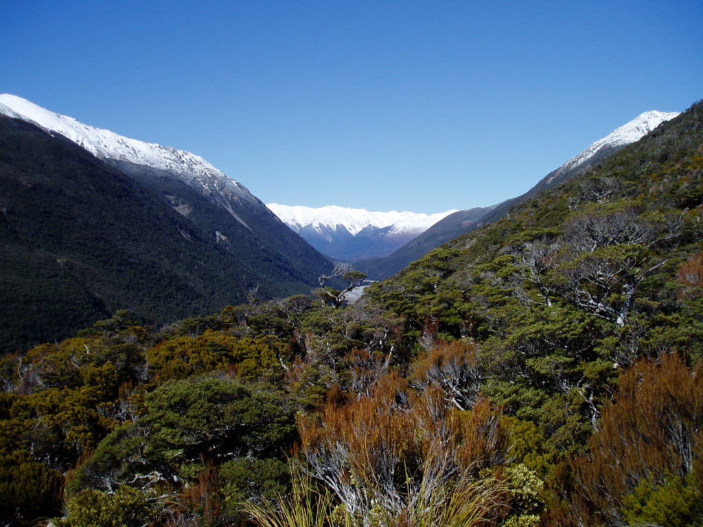
Hike to Avalanche peak, Arthurs Pass, New Zealand
Bibliography, Sources, and Recommended Reading:
The Secret Lives of Colour -Kassia St Clair
Artists’ Pigments- A Handbook of Their History and Characteristics
Volume 3 Elisabeth West Fitzhugh, Editor
Rossol, Monona. Artists Complete Health & Safety Guide 3rd Edition, Watson-Guptill Publications, New York 2001.
DISCLAIMER: This article concerns itself with the common-sense safety aspects of art materials and art safety in general. The intent of this article is merely to raise individual awareness of some of the issues involved and to encourage the reader to take steps in learning more about the factors involved with the hazards associated with art materials. The author may change the contents of this document at any time, either in whole or in part.
No Comments